top of page

"来来"
Noodle Stall
Brand Logo
Client
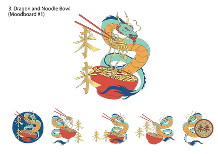
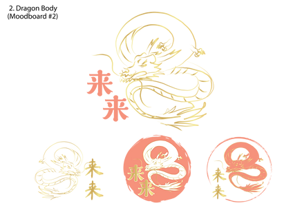
"来来" is an upcoming local noodle stall that has just started out. The client requested a logo with gold colours to be included, a dragon element and no dark or black colours to be used. Below shows the ideation process, sketches, 2 different moodboards proposed and potential layouts.
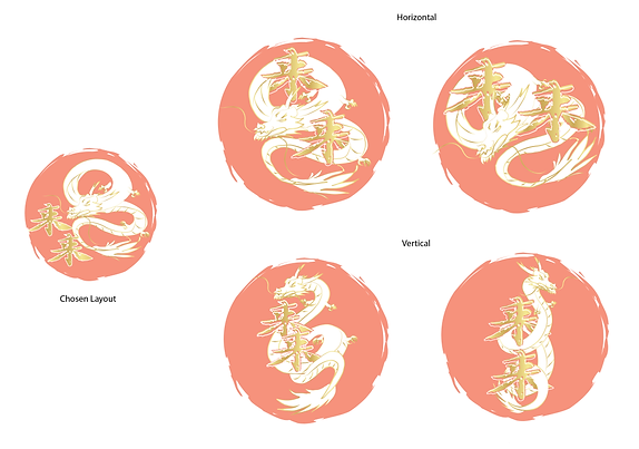
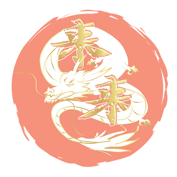
After choosing the layout and style of the logo, the client wanted the dragon to be wrapped around the Chinese characters. Hence, I presented both horizontal and vertical options and the flow of the dragon. The final logo smooth lines but also some untouched as to not ruin the overall "hand-drawn" feel and look.


bottom of page